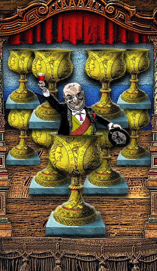
There's so much to read and learn about Tarot on the web and in little white books and in apps and historical texts that I haven't actually bought or wanted to buy a book on the subject since my first, Mary Greer's
Tarot For Your Self. But now I find myself actually looking forward to the release of a new tarot book -- specifically,
Secrets of the Waite - Smith Tarot by Marcus Katz and Tali Goodwin. Why? Because it's the first positive proof that
Pamela Colman-Smith had much more influence on her deck than has previously been publicly acknowledged, and because the authors have done the research and can now show us exactly what the artist was thinking when she created the images. All artists are influenced by something, and there's a kind of joy in learning the connections between
Colman-Smith and her influences. The website that the authors have set up to tease the book's release has already provided a wealth of information, and one of my favorite entries there centers around the enigmatic
two of pentacles.
You have to admit that the imagery
Colman-Smith came up with for the card does support the many and various interpretations that have been assigned to it down the years... including my own oddball take on it in my
Tarot of the Zirkus Mägi, where I used
VIRTUOSO as the keyword.
For this deck, for this card, I specifically focused on Marcus and Tali's revealed interpretation, "False promises, deliberate miscommunication," and "the mercurial nature of communication."
Mister Punch is nothing if not a Trickster Figure himself, which is part of what makes him the perfect subject for a tarot deck. He is not to be trusted. The editors of the long-running British humor magazine Punch seem to have known that and incorporated it specifically into much of the magazine's cartooning, including the famous cover art showing Punch painting a portrait of a noble and royal British lion -- using his dog Toby as the model!
I had planned to use this image in another part of the deck, but based on the excerpt from Marcus and Tali's book I thought that it fitted better here.
And it does -- although making it work visually turned out to be a royal pain in the ass!!
Although I had access to a high-definition scan of the cover, the artwork was still too dense and would not "clean up" sufficiently for me to color it using my normal methods. I was forced to resort to several other techniques that I'm not so comfortable with and that I actually kind of dislike... and the results were extremely frustrating. I reconsidered coloring it at all -- but just slapping the scan into the card didn't go down well with me, and clashed visually with everything else I've done on the deck. After many hours, just by sticking with it and not giving up, and applying layer after layer of color and shadows along with some judicious filter work, I finally got the result that you see above... and maybe it's just because it gave me so much trouble and looked so very butt-ugly for most of the time that I was working on it, but I'm at last extremely happy with the result. Just so you can see how far I went and how much I did, here is the image I started with:
-- Frede.


